How can we increase the conversion of visitors into to new clients and make the process of ordering and scheduling easier for current clients.
Redesign the current website to make the first impression and user experience enjoyable by utilizing current branding guidelines in a more visually appealing way.
This project is an update on the current visual layout of the website. Moving forward, I intend to redesign the full user experience of how onboarding and scheduling occur. Similarly, I believe that different dashboards for the various user types can make the website a central hub for the company: customers, trainers, nutritionists, chefs, etc.
UX/UI Designer
2 weeks
Figma, Miro
Interviews
Business Goals
Current Pain Points
Understand Goals
Current Branding
Determine Key Problems
Explore Solutions
Design Requirements
Ideations
Sketching
Wireframes
Interactive Prototype
Iterations
Usability Testing
Start your journey from anywhere on the website.
Dedicated page for potential customers to preview available meals.
Find the training program the fits your needs.
I conducted an interview with the CEO of Sakami Health Science, Ian Matthew, to understand the business's products, the current state, and intended goals to achieve. The purpose was to empathize with the needs of the business and how it can properly align with potential client experiences. Throughout the design process, I regularly checked in with Ian Matthew to ensure that the solution I created fit Sakami Health Science's needs.
Utilize current Sakami branding guidelines to create a impactful landing page when visitors enter the site for the first time.
Allow visitors to learn essential information and explore options available for nutrition and training.
Implamanet a sign up process to streamline initial communication and orientation between staff and client.
At every page there should be incentive to encourage the visitor to sign up and learn more information on various Sakami Health Science programs.
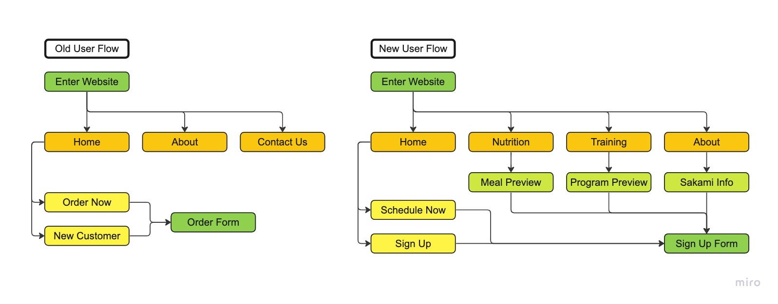
Currently, there are many opportunities for growth in the design of the current website. Moving past the lack of an about and contact page, the process of new client onboarding needs to be revamped. With the design in use, potential new clients have to fill out meal delivery information and an order form that take 10 steps before contacting a Sakami associate. However, as discussed during the interview, new members must have a consultation before they are able to order food. Likewise, the immediate prompting to order food solidifies the idea that Sakami is a food delivery service and disregards the nutrition consultation and personal training programs. As discussed during the interview as well, the new design intends to bring balance and fully represent Sakami Health Science as an all encompassing health and wellness company.
The New User Flow allows for user exploration of Sakami's offerings. It also allows for the potential clients to create an account and get in contact for consultation before filling out an order form. The Old User Flow immediately directed potential users to the order form which is not needed since clients must schedule a consultation before they can order food.

To improve upon the current design I created a new design system. Taking standard UX practices into consideration, I developed an atom-based component set that follows Sakami's branding guidelines. Since I took an atom-based approach to design, the current components and future ones can be easily created and remain consistent across the website.

The current scope was improving the initial impression of potential clients in order to encourage an increase conversion. The next steps include designing Dashboards for the different user types: clients, nutritionists, trainers, chefs, etc. We intend on communicating with our web developer to determine feasibility of multiple dashboards as well as for the implementation of the currrent design update.